
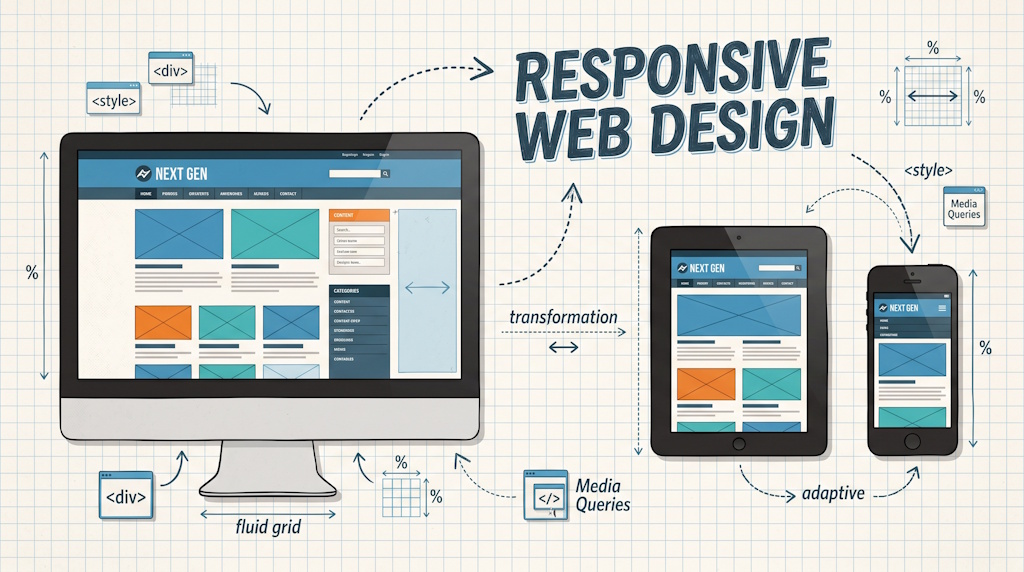
While updating our website, we have added so called “responsiveness” to it using Bootstrap 3.0 and applying different grid system settings to make sure it adapts to the device on which the website is used.
That is a lot of geek talk to say that users get a layout that matches their device.
That is: mobile phone users get the information stacked while desktop users (with a wide screen browser) may see the same information presented in columns next to each other.
 |
Implementation
For the implementation, we added Bootstrap to the MDXS.net project. In fact, using their Content Delivery Network (CDN) resources for faster load times. Below is more geek talk on the concepts used.Grid System of Bootstrap
We then re-arranged the information to utilize the 12 column grid system of Bootstrap 3.0; tagging with ".col-XX-##" classes how information on a row should be spread across these 12 columns. Here, the "XX" part specifies the type of display; such as xs, sm, md, and lg (for: extra small, small, medium, and large). While the "##" determines over how many columns the information block should span on that set display.With some smart combinations (adding multiple ".col-XX-##" classes, for different devices, to the same information block) the effect is that the page configures itself to the screen estate available. It remains fun to see the result on a tablet, switching between portrait and landscape mode by turning the device; as the layout (of the website inside the browser) adapts to the available screen estate.
Push, Pull, and Offset
Bootstrap provides more options to determine the page behaviour; but we didn't need to use these (yet) on our website. For some more information, the tutorials at http://www.easydevtuts.com/tutorials/learn-bootstrap-3-0-grid-system/ explain the Bootstrap 3.0 Grid System, including the row/column concept and these more advanced push, pull, and offset approaches.Visible or Hidden
The above mentioned tutorials also explain the use of ".visible-XX" and ".hidden-XX" classes. One good use we found is to apply it to a break tag; using "<br class="hidden-xs hidden-sm"/>" to ensure that a line break which made sense on normal screens isn't applied when using it on tablets or mobile phone browsers.Result
Visit our website at http://www.mdxs.net to see the result. Ideally use different devices, like your desktop or laptop computer, your tablet, and your mobile phone; and notice the differences.Or emulate the different devices by resizing the browser window on your desktop/laptop to make it either very wide or very small. Resize it slowly and notice the layout changes to best fit the screen estate available.