
Adding Responsiveness
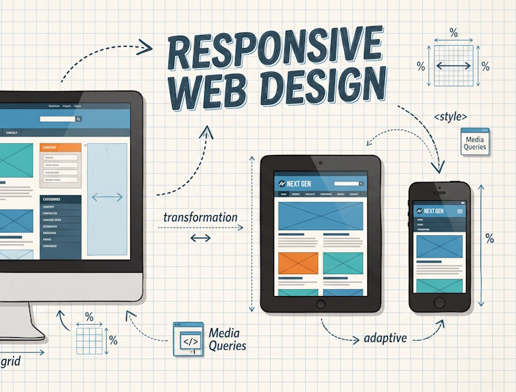
While updating our website, we have added so called “responsiveness” to it using Bootstrap 3.0 and applying different grid system settings to make sure it adapts to the device on which the website is used. That is a lot of geek talk to say that users get a layout that matches their device. That is: mobile phone users get the information stacked while desktop users (with a wide screen browser) may see the same information presented in columns next to each other.
Read more »